

Программы тренировок от известных тренеров в удобном Telegram-боте. 500+ упражнений с видео для дома и зала, планы под ваши цели - похудение, набор массы или поддержание формы
Попробовать бесплатноДобро пожаловать на заключительный урок модуля "Навыки письма"! Сегодня мы изучим особенности описания графиков, диаграмм и тенденций на английском языке — навык, который необходим для:
- Сдачи международных экзаменов (IELTS, TOEFL, Cambridge English)
- Написания академических работ и отчетов
- Бизнес-презентаций и деловой коммуникации
- Анализа данных в профессиональной среде
- Понимания экономических и научных публикаций
Умение четко и точно описывать числовые данные, графические представления и тенденции — это важная часть академического и профессионального английского. В этом уроке мы рассмотрим специальную лексику и грамматические конструкции, которые помогут вам грамотно анализировать и комментировать различные типы графиков и диаграмм.
🎯 Типы графиков и диаграмм
📚 Основные типы графических представлений данных
| Тип | Английское название | Что показывает | Когда используется |
|---|---|---|---|
| Линейный график | Line graph/chart | Изменения во времени, тренды | Для отслеживания изменений за период времени |
| Столбчатая диаграмма | Bar chart/graph | Сравнение категорий | Для сравнения различных групп или категорий |
| Круговая диаграмма | Pie chart | Доли от целого | Для показа пропорций и процентных соотношений |
| Точечная диаграмма | Scatter plot | Взаимосвязь между переменными | Для изучения корреляций и взаимозависимостей |
| Гистограмма | Histogram | Распределение частот | Для анализа распределения значений |
| Таблица | Table | Структурированные данные | Для организации числовых или текстовых данных |
| Комбинированный график | Combination chart | Сложные взаимосвязи | Для представления разных типов данных на одном графике |
| Диаграмма с областями | Area chart | Кумулятивные значения | Для отображения величин и их накопления |
📚 Названия элементов графика
| Русский | Английский | Примеры использования |
|---|---|---|
| Заголовок | Title/Heading | The title of the graph states "Global Temperature Changes 1990-2020." |
| Легенда | Legend/Key | According to the legend, the blue line represents sales in Europe. |
| Ось X (горизонтальная) | X-axis/Horizontal axis | The x-axis shows the months of the year. |
| Ось Y (вертикальная) | Y-axis/Vertical axis | The y-axis displays temperature in degrees Celsius. |
| Шкала | Scale | The scale on the y-axis ranges from 0 to 100 million dollars. |
| Метка данных | Data label | The data labels indicate the exact percentage for each segment. |
| Точка данных | Data point | Each data point on the line represents a monthly measurement. |
| Линия тренда | Trend line | The trend line shows an overall upward trajectory despite fluctuations. |
| Пик | Peak | The graph reaches its peak in December with 125 units sold. |
| Спад | Trough/Dip | There was a significant dip in sales during the summer months. |
| Столбец/сегмент | Bar/Column/Segment | The tallest bar in the chart represents China's population. |
| Доля/сектор | Slice/Sector | The largest slice of the pie chart represents entertainment expenses. |
| Интервал | Interval | The data was collected at regular intervals of six months. |
🔍 Ключевая лексика для описания графиков
Существительные для описания изменений
| Существительное | Определение | Пример использования |
|---|---|---|
| rise | увеличение | There was a sharp rise in oil prices in 2022. |
| increase | рост, увеличение | The graph shows an increase of 25% in online sales. |
| growth | рост, развитие | The company experienced steady growth over five years. |
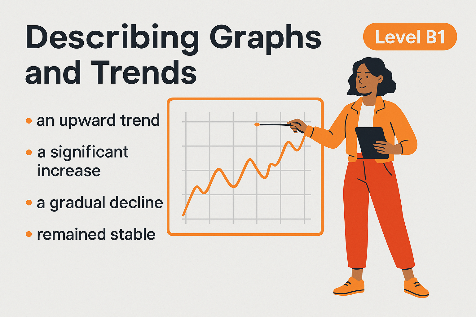
| upward trend | восходящая тенденция | The upward trend in house prices continued throughout the decade. |
| surge | резкий скачок | The graph indicates a sudden surge in unemployment after the financial crisis. |
| peak | пик, максимум | Retail sales reached their peak during the holiday season. |
| climb | подъем | A steady climb in temperature was recorded from March to July. |
| jump | скачок | There was a significant jump in inflation rates in the second quarter. |
| decline | снижение | The chart shows a gradual decline in physical book sales. |
| decrease | уменьшение | A substantial decrease in rainfall was observed during this period. |
| drop | падение | The graph indicates a sharp drop in tourism in 2020. |
| fall | падение | The fall in stock prices alarmed investors. |
| reduction | сокращение | There has been a significant reduction in carbon emissions since 2015. |
| downturn | спад | The economic downturn affected most industries in the region. |
| slump | резкий спад | The housing market experienced a slump during the recession. |
| dip | временное падение | The line graph shows a temporary dip in profits in February. |
| fluctuation | колебание | Price fluctuations were common throughout the observed period. |
| stability | стабильность | The market showed remarkable stability despite external pressures. |
| plateau | плато, период без изменений | After rapid growth, sales reached a plateau from 2018 to 2020. |
| recovery | восстановление | The graph demonstrates a steady recovery following the initial decline. |
Глаголы для описания изменений
| Глагол | Определение | Пример использования |
|---|---|---|
| to rise | расти, подниматься | Temperatures rose by 2°C over the decade. |
| to increase | увеличиваться | Coffee consumption increased steadily from 2010 to 2020. |
| to grow | расти, увеличиваться | The population grew by 15% in just five years. |
| to climb | подниматься | Unemployment rates climbed to 8% during the recession. |
| to soar | стремительно расти | Property prices soared in the capital city. |
| to surge | резко повышаться | Online shopping surged during the pandemic. |
| to peak | достигать пика | Sales peaked in December at 10,000 units. |
| to jump | резко повышаться | Shares jumped by 15 points after the announcement. |
| to decline | снижаться | Manufacturing output declined gradually over the last quarter. |
| to decrease | уменьшаться | The number of cases decreased by 30% following the vaccination campaign. |
| to drop | падать | Temperatures dropped significantly in January. |
| to fall | падать | Profits fell by 22% compared to the previous year. |
| to reduce | сокращаться | The company's expenses reduced by 15% after implementing new policies. |
| to slump | резко падать | Car sales slumped during the economic crisis. |
| to dip | временно снижаться | The figures dipped slightly before rising again. |
| to plummet | стремительно падать | The value of the currency plummeted overnight. |
| to fluctuate | колебаться | Oil prices fluctuated throughout the year. |
| to level off | выравниваться | After rapid growth, the trend leveled off in 2019. |
| to stabilize | стабилизироваться | The market began to stabilize after a period of volatility. |
| to recover | восстанавливаться | The economy recovered slowly after the recession. |
Прилагательные и наречия для описания изменений
| Прилагательное/наречие | Значение | Пример использования |
|---|---|---|
| significant | значительный | There was a significant increase in renewable energy use. |
| substantial | существенный | A substantial rise in housing costs was recorded. |
| dramatic | резкий, впечатляющий | The chart shows a dramatic fall in air travel during 2020. |
| sharp | резкий | A sharp decline in oil prices occurred in March. |
| steep | крутой, резкий | The graph indicates a steep rise in online shopping. |
| slight | незначительный | There was a slight decrease in rainfall last summer. |
| gradual | постепенный | The data shows a gradual improvement in literacy rates. |
| steady | устойчивый, постоянный | We can observe a steady growth in GDP over five years. |
| rapid | быстрый | The company experienced rapid expansion between 2015 and 2018. |
| slow | медленный | There was a slow decline in traditional media consumption. |
| abrupt | внезапный, резкий | An abrupt change in consumer behavior occurred after the crisis. |
| marginal | незначительный, предельный | Only a marginal increase was observed in the third quarter. |
| considerable | значительный | The graph shows a considerable difference between urban and rural areas. |
| marked | заметный, выраженный | There was a marked improvement in air quality. |
| exponential | экспоненциальный | Social media users grew at an exponential rate. |
| minor | незначительный | Only minor fluctuations were recorded during this period. |
| notable | примечательный | A notable uptick in tourism occurred after 2015. |
| modest | умеренный | There was a modest increase in tax revenue. |
| significant | существенный | The data reveals a significant correlation between these factors. |
| negligible | незначительный, несущественный | The difference between the two groups was negligible. |
Фразы для описания частоты и времени
| Фраза | Значение | Пример использования |
|---|---|---|
| over the period | за период | Over the period from 2010 to 2020, temperatures increased by 1.5°C. |
| during this time | в течение этого времени | During this time, there were significant fluctuations in oil prices. |
| throughout the year | в течение всего года | Throughout the year, sales remained relatively stable. |
| from... to... | с... по... | From January to June, there was a steady rise in unemployment. |
| between... and... | между... и... | Between 2018 and 2020, the company's profits doubled. |
| in the first/second quarter | в первом/втором квартале | In the first quarter, there was a sharp decline in tourism. |
| at the beginning/end of | в начале/конце | At the beginning of the year, stock prices fell dramatically. |
| at the outset | в начале | At the outset, growth was slow but steady. |
| subsequently | впоследствии | Prices fell in January and subsequently recovered in March. |
| initially | изначально | Initially, there was a rapid increase in new subscriptions. |
| eventually | в конечном итоге | The market eventually stabilized after months of volatility. |
| ultimately | в конечном счете | Ultimately, the figures returned to pre-crisis levels. |
| currently | в настоящее время | The industry is currently experiencing steady growth. |
| formerly | ранее, прежде | The sector that was formerly dominant now represents only 15% of the market. |
| lately | в последнее время | Lately, there has been an upward trend in hybrid vehicle sales. |
| recently | недавно | Prices have recently shown signs of stabilization. |
| previously | ранее | Previously, the market had been in decline for several years. |
🧠 Грамматические особенности описания графиков
1. Использование времен
Present Simple для описания представленных данных
- The graph shows the changes in oil prices between 2010 and 2020.
- The bar chart illustrates the population growth in major cities.
- The pie chart represents the distribution of household expenses.
- The table indicates that unemployment has fallen in recent years.
Past Simple для описания прошлых тенденций
- From 2015 to 2018, unemployment rose by 5 percentage points.
- Sales increased dramatically in the fourth quarter.
- The number of tourists declined significantly during the winter months.
- In 2019, profits reached their highest point at $3.2 million.
Present Perfect для связи прошлых данных с настоящим
- Since 2010, the population has grown by approximately 12%.
- The company's revenue has increased steadily over the past five years.
- Internet usage has risen dramatically among all age groups.
- The average temperature has fallen by 2°C compared to last year's readings.
Present Perfect Continuous для описания продолжающихся тенденций
- The market has been growing consistently since the beginning of the year.
- Oil prices have been falling for the past three months.
- Inflation has been increasing at an alarming rate.
- The company has been experiencing a steady decline in sales.
2. Пассивный залог
Пассивный залог часто используется при описании графиков, чтобы сосредоточиться на данных, а не на действующих лицах:
- A significant increase in online sales was recorded between 2018 and 2020.
- The highest level of precipitation was observed in November.
- A correlation between education level and income can be seen in the scatter plot.
- The most dramatic changes were experienced by the manufacturing sector.
- The results are shown on the graph below.
3. Сравнительные и превосходные степени прилагательных
Сравнения необходимы при анализе различий между данными:
- The rate of inflation in 2022 was higher than the previous year.
- Online sales showed a more significant increase than in-store purchases.
- The largest proportion of the budget was allocated to healthcare.
- This was the most dramatic rise in unemployment in the past decade.
- A less substantial decrease was observed in the second quarter.
- The least affected region was the Southwest, with only a 2% decline.
4. Причинно-следственные связи
Для объяснения причин и следствий изменений:
- Due to the economic crisis, consumer spending fell sharply.
- The increase in sales was a result of the new marketing campaign.
- As a consequence of higher oil prices, transportation costs rose significantly.
- Owing to technological innovations, productivity improved by 15%.
- The decline in tourism led to a reduction in local business revenue.
- Because of the pandemic, there was an unprecedented surge in remote working.
5. Предлоги и фразы для указания изменений
- The unemployment rate increased from 5% to 8%.
- There was a rise in consumer spending over the summer months.
- Profits fell by 15% during the first quarter.
- Exports declined to their lowest level in five years.
- The population grew by approximately 2.5 million people.
- Sales remained stable at around 10,000 units per month.
- The figures ranged between 250 and 300 units.
6. Вводные фразы для представления графиков
- This graph illustrates/shows/depicts the changes in global temperatures from 1990 to 2020.
- As can be seen from the chart, coffee consumption varies significantly by country.
- The pie chart provides information about/on household expenditure in the UK.
- The data presented in the bar graph indicates a strong correlation between exercise and health.
- This line graph represents the fluctuations in oil prices over the past decade.
- The table below summarizes the key findings of the research.
🔍 Структура описания графика
1. Введение (Introduction)
Во введении следует представить график и его основное содержание:
- Что показывает график (тип данных, тема, переменные)
- Тип графика (линейный, столбчатый, круговой и т.д.)
- Временной период или категории (если применимо)
Языковые структуры для введения:
- "The graph shows/illustrates/depicts..." (График показывает/иллюстрирует/изображает...)
- "The chart presents information about..." (Диаграмма представляет информацию о...)
- "The table provides data on..." (Таблица предоставляет данные о...)
- "The pie chart breaks down..." (Круговая диаграмма разбивает...)
Пример введения: "The line graph illustrates the changes in internet usage across different age groups in the United States between 2000 and 2020. The data is measured in average hours spent online per week."
2. Обзор (Overview)
Обзор предоставляет общее впечатление о данных — основные тенденции, ключевые моменты или заметные особенности:
- Общие тенденции (рост, спад, стабильность)
- Самые высокие/низкие точки
- Примечательные аномалии или исключения
Языковые структуры для обзора:
- "Overall, it can be seen that..." (В целом видно, что...)
- "The most noticeable trend is..." (Наиболее заметная тенденция — это...)
- "It is clear from the data that..." (Из данных ясно, что...)
- "Generally speaking, there was a..." (Говоря в общем, наблюдался...)
Пример обзора: "Overall, the graph shows a significant increase in internet usage across all age groups over the 20-year period. However, the most dramatic rise occurred among adults aged 65 and over, while teenagers consistently remained the highest users throughout the entire period."
3. Детальный анализ (Detailed Analysis)
В этой части необходимо описать конкретные детали и тенденции по отдельным категориям, периодам или сегментам:
- Конкретные цифры и процентные изменения
- Сравнения между различными категориями
- Периоды роста, снижения или стабильности
- Причины изменений (если они очевидны из контекста)
Языковые структуры для детального анализа:
- "Looking at the data for [category], we can see that..." (Глядя на данные для [категории], мы видим, что...)
- "In [time period], there was a [significant/slight] [increase/decrease] in..." (В [период времени] произошло [значительное/незначительное] [увеличение/уменьшение]...)
- "The figure for [category] stood at [value] in [year], before [rising/falling] to [value] by [year]." (Показатель для [категории] составлял [значение] в [год], прежде чем [вырасти/упасть] до [значение] к [году].)
- "Compared to [category], the [other category] shows a [higher/lower] rate of [change]." (По сравнению с [категорией], [другая категория] показывает [более высокий/низкий] темп [изменения].)
Пример детального анализа: "Looking at specific age groups, teenagers (13-19) started at around 10 hours per week in 2000, which increased steadily to reach 25 hours by 2020, representing a 150% increase. Young adults (20-34) showed a similar pattern, beginning at 8 hours weekly and rising to 22 hours by the end of the period.
The most dramatic change, however, occurred among seniors (65+), who spent merely 2 hours online per week in 2000. This figure grew exponentially, especially after 2010, reaching 15 hours by 2020 – a 650% increase over the two decades. This substantial growth likely reflects improved digital literacy and increased accessibility of technology for older generations."
4. Заключение (Conclusion)
Заключение может содержать краткое резюме основных тенденций или прогноз на будущее (если это уместно):
- Обобщение ключевых моментов
- Возможные причины или последствия наблюдаемых тенденций
- Предположения о будущих тенденциях (при необходимости)
Языковые структуры для заключения:
- "In conclusion, the data indicates that..." (В заключение, данные указывают, что...)
- "To summarize, the most significant changes occurred in..." (Подводя итог, наиболее значительные изменения произошли в...)
- "If this trend continues, we might expect..." (Если эта тенденция продолжится, можно ожидать...)
- "These figures suggest that..." (Эти цифры предполагают, что...)
Пример заключения: "In conclusion, the data clearly demonstrates a universal increase in internet usage across all demographics between 2000 and 2020, with particularly notable growth among older adults. These trends reflect the increasing digitalization of daily activities and services, as well as improved internet accessibility across the United States. If these patterns continue, we might expect to see a further convergence of usage rates across different age groups in the coming years."
⚠️ Типичные ошибки при описании графиков
-
Отсутствие общего обзора
- ❌ Сразу переходить к деталям без предоставления общей картины
- ✅ Сначала дать общее представление о главных тенденциях, затем переходить к деталям
-
Избыточное повторение данных
- ❌ "The graph shows that sales in January were 100 units, in February they were 120 units, in March they were 140 units..."
- ✅ "Sales increased steadily during the first quarter, rising from 100 units in January to 140 units by March."
-
Неправильное использование времен
- ❌ "The pie chart is showing the breakdown of expenditure." (Present Continuous)
- ✅ "The pie chart shows the breakdown of expenditure." (Present Simple)
-
Ошибки в использовании предлогов с числовыми изменениями
- ❌ "Prices increased to 15%."
- ✅ "Prices increased by 15%."
-
Отсутствие специфических цифр
- ❌ "Sales increased a lot during the year."
- ✅ "Sales increased by approximately 45% during the year, from 200 to 290 units."
-
Собственная интерпретация без опоры на данные
- ❌ "The decline in sales was due to poor management decisions."
- ✅ "The data shows a decline in sales during this period, which coincided with economic recession."
-
Отсутствие сравнений между категориями
- ❌ Описание каждой категории изолированно, без сравнения
- ✅ "While urban areas experienced growth of 12%, rural regions grew by only 3% during the same period."
-
Неправильное использование вводных фраз
- ❌ "As shown in the chart above..." (когда график находится ниже)
- ✅ "As illustrated in the following chart..." или просто "The chart illustrates..."
-
Однообразная лексика
- ❌ Многократное использование "increase" и "decrease"
- ✅ Использование разнообразных синонимов: "rise", "surge", "growth", "decline", "drop", "fall", etc.
-
Игнорирование единиц измерения
- ❌ "Inflation rose from 2 to 5."
- ✅ "Inflation rose from 2% to 5% during this period."
👥 Примеры описания графиков с языковым анализом
Пример 1: Линейный график
Subject: Analysis of Global Internet Users (2000-2020)
[Заголовок четко указывает на тему анализа]
The line graph illustrates the growth in the number of global internet users over a 20-year period from 2000 to 2020, measured in billions of people.
[Введение: указание типа графика, темы и временного периода с использованием Present Simple]
Overall, there was a dramatic increase in internet usage worldwide throughout the entire period, with the most significant growth occurring between 2010 and 2020. The number of users rose from just under 0.5 billion in 2000 to approximately 4.5 billion by 2020.
[Обзор: общая тенденция с указанием начальной и конечной точек - использование Past Simple для описания прошлых тенденций]
Looking at the details, in 2000, global internet users numbered only around 0.4 billion. During the first decade, there was a steady but relatively modest growth, with the figure reaching approximately 1.8 billion by 2010, representing an increase of 350% over ten years.
[Детальный анализ первого периода: конкретные цифры и процентные изменения - использование Past Simple и пассивных конструкций]
However, from 2010 onwards, the rate of growth accelerated significantly. Between 2010 and 2015, the number of users nearly doubled, reaching about 3.2 billion. This rapid expansion continued, albeit at a slightly slower pace, in the final five years of the period, with a further increase of 1.3 billion users by 2020.
[Детальный анализ второго периода: сравнение темпов роста в разные периоды - использование Past Simple и сравнительных конструкций]
The most dramatic annual increase can be observed between 2012 and 2013, when approximately 0.5 billion new users gained internet access – the largest year-on-year growth in the entire period. By contrast, the slowest growth occurred between 2000 and 2005, when user numbers increased by only 0.3 billion over five years.
[Анализ экстремальных значений: сравнение максимального и минимального роста - использование пассивного залога и превосходной степени]
In conclusion, the data clearly demonstrates the remarkable digitalization of global society over these two decades, with internet users increasing more than tenfold from 2000 to 2020. This exponential growth reflects improved infrastructure, reduced costs, and the increasing integration of internet services into daily life across the world. If this trend continues, we might expect to see near-universal internet access in developed regions within the next decade.
[Заключение: обобщение тенденции, возможные причины и прогноз на будущее - использование Present Perfect для связи с настоящим и модальных конструкций для прогнозов]
Пример 2: Круговая диаграмма
Subject: Analysis of Household Expenditure in the UK (2022)
[Заголовок указывает на тип данных и период]
The pie chart illustrates how an average UK household allocated its monthly budget across different expenditure categories in 2022. The data is presented as percentages of total household spending.
[Введение: указание типа диаграммы, темы и формата данных]
At first glance, it is evident that housing costs accounted for the largest proportion of expenditure, while luxury items represented the smallest share. The four largest categories together constituted over three-quarters of total household spending.
[Обзор: выделение основных особенностей без подробных цифр]
Looking at the data in detail, housing costs (including rent or mortgage payments and utilities) dominated household expenditure, representing 35% of the total budget. This was more than twice the amount spent on the second-largest category, food and beverages, which stood at 15% of total spending.
[Детальный анализ: начало с самой большой категории, использование сравнительных конструкций]
Transportation and healthcare were similarly significant expenses, accounting for 14% and 12% of the budget respectively. Combined, these two categories (26%) represented just under three-quarters of the amount spent on housing.
[Продолжение анализа: группировка категорий среднего размера и их сравнение с крупнейшей категорией]
Education and entertainment each took an identical share of 8%, together consuming approximately one-sixth of the total household budget. Clothing was allocated 7% of expenditure, while savings and investments accounted for 6% – the second-smallest category.
[Анализ малых категорий: использование дробей и пропорций для описания]
Notably, luxury items represented the smallest slice of the pie chart at just 5% of total spending, indicating that essential expenses dominated most households' financial priorities in 2022.
[Анализ наименьшей категории с интерпретацией, основанной на данных]
In conclusion, the chart clearly shows that essential costs – particularly housing, food, transportation, and healthcare – consumed the vast majority (76%) of an average UK household's budget in 2022. Discretionary spending on categories such as entertainment and luxury items accounted for a relatively small proportion of total expenditure, reflecting the economic pressures faced by many families during this period.
[Заключение: группировка категорий по типу (необходимые vs. дискреционные расходы) и интерпретация в более широком экономическом контексте]
Пример 3: Столбчатая диаграмма
Subject: Comparison of CO₂ Emissions by Country (2010 vs. 2020)
[Заголовок указывает на сравнительный характер данных и временной период]
The bar chart compares the carbon dioxide emissions of five major economies in 2010 and 2020, measured in billions of tonnes. The countries represented are China, the United States, India, Russia, and Japan.
[Введение: тип графика, тема, временные точки, единицы измерения и перечисление категорий]
Overall, the chart reveals that while some nations reduced their emissions over the decade, others experienced increases, with China remaining the largest emitter by a substantial margin in both years. The combined global emissions from these five countries increased slightly from 2010 to 2020.
[Обзор: обобщение основных тенденций и общего итога]
Examining the data more closely, China was by far the largest carbon dioxide emitter in both time periods. In 2010, its emissions stood at approximately 8.5 billion tonnes, and this figure rose significantly to 11.2 billion tonnes by 2020, representing an increase of around 32%. This growth was the largest among all five nations, both in absolute and percentage terms.
[Детальный анализ начинается с крупнейшей категории: конкретные цифры, абсолютные и процентные изменения]
In contrast, the United States, the second-largest emitter, showed a notable decrease in emissions over the decade. In 2010, US emissions were approximately 5.8 billion tonnes, but by 2020 they had fallen to 4.9 billion tonnes – a reduction of about 15%. Despite this decline, the US remained well above all other countries except China.
[Анализ второй категории с противопоставлением первой: использование "In contrast" и процентных изменений]
India demonstrated the second-largest growth in emissions after China, with figures rising from 1.7 billion tonnes in 2010 to 2.6 billion tonnes in 2020 – an increase of roughly 53%. This substantial growth positioned India as the third-largest emitter by 2020, overtaking Russia, which had occupied this position in 2010.
[Анализ категории с наибольшим процентным ростом и изменением в рейтинге]
Russia's emissions remained relatively stable, with a slight decrease from 1.8 billion tonnes in 2010 to 1.7 billion tonnes in 2020, representing a modest reduction of approximately 5%. Meanwhile, Japan exhibited the most significant percentage decrease among the five nations, with emissions falling by about 18% from 1.3 billion tonnes to 1.1 billion tonnes over the decade.
[Завершение анализа с категориями наименьших изменений]
In conclusion, the data highlights divergent trends in carbon emissions among major economies during the 2010-2020 period. While developed nations like the United States and Japan reduced their carbon footprint, rapidly industrializing countries such as China and India substantially increased their emissions. These contrasting patterns reflect differences in economic development stages, energy policies, and commitments to environmental sustainability among these nations.
[Заключение: обобщение различных тенденций с интерпретацией возможных причин]
📚 Итоговая таблица: Глаголы изменения и их использование
| Характер изменения | Глаголы для роста | Глаголы для падения | Пример использования |
|---|---|---|---|
| Постепенное изменение |
rise gradually increase steadily grow slowly climb gradually |
fall graduall decrease steadily decline slowly drop slightly |
"Temperatures rose gradually throughout the spring months." "Sales declined slowly during the third quarter." |
| Резкое изменение |
rise sharply increase dramatically soar surge rocket skyrocket |
fall sharply decrease dramatically plummet plunge collapse crash |
"Stock prices soared following the announcement." "Tourism plummeted during the pandemic." |
| Небольшое изменение |
edge up creep up increase slightly rise marginally |
edge down dip decrease slightly fall marginally |
"Inflation edged up by 0.2% in April." "Sales dipped slightly during the summer months." |
| Достижение максимума/минимума |
peak reach a high point hit a maximum reach its highest level |
bottom out reach a low point hit a minimum reach its lowest level |
"Unemployment peaked at 10% in 2010." "House prices bottomed out in 2009." |
| Стабилизация после изменения |
level off stabilize plateau remain steady |
stabilize flatten out stop falling remain stable |
"After rapid growth, sales leveled off in 2019." "Prices finally stabilized after months of decline." |
| Возвращение к предыдущему уровню |
recover rebound bounce back return to previous levels |
return to previous levels recover bounce back revert |
"The market rebounded strongly in the fourth quarter." "Exports have bounced back to pre-crisis levels." |
| Колебания |
fluctuate vary oscillate go up and down |
fluctuate vary oscillate go up and down |
"Oil prices fluctuated wildly throughout the year." "Interest rates varied between 3% and 5% during this period." |
| Поддержание тренда |
continue to rise maintain upward trend sustain growth keep increasing |
continue to fall maintain downward trend sustain decline keep decreasing |
"Inflation continued to rise for six consecutive months." "Retail sales maintained a downward trend throughout 2020." |
📝 Упражнения
Упражнение 1: Подбор синонимов
Подберите синонимы для следующих глаголов, описывающих изменения данных:
- to increase
- to decrease
- to rise
- to fall
- to peak
- to fluctuate
- to recover
- to stabilize
Упражнение 2: Выбор правильных предлогов
Заполните пропуски подходящими предлогами:
- The sales increased _____ 200 units _____ 350 units.
- There was a rise _____ 15% _____ the number of tourists.
- Unemployment fell _____ 8% _____ 5% _____ the past year.
- The figures ranged _____ 10 million _____ 15 million.
- The company's profits decreased _____ 30% _____ 2020.
- Inflation remained stable _____ around 2%.
- The population grew _____ approximately 500,000 people.
- Exports declined _____ their lowest level _____ a decade.
Упражнение 3: Использование подходящих времен
Выберите правильную форму глагола:
- The graph (shows / is showing / has shown) the changes in oil prices over the past decade.
- Between 2010 and 2015, the population (increased / was increasing / has increased) by 12%.
- Since 2018, average temperatures (rose / have risen / have been rising) steadily.
- The data in the table (indicates / is indicating / has indicated) a strong correlation between these variables.
- The number of internet users (doubled / has been doubling / has doubled) since the last survey.
- The stock market (reached / has reached / was reaching) its peak in December 2022.
- Over the past six months, sales (fell / have been falling / have fallen) gradually.
- From May to August, tourism (increased / was increasing / has increased) dramatically.
Упражнение 4: Описание графических данных
Напишите 2-3 предложения, описывающие каждый из следующих сценариев, используя подходящую лексику и грамматические конструкции:
- Цены на жилье резко выросли в 2021 году, достигли пика в начале 2022 года, а затем начали постепенно снижаться.
- Уровень безработицы колебался между 4% и 6% на протяжении десятилетия без явной тенденции.
- Продажи компании неуклонно росли в течение первых трех кварталов, но резко упали в четвертом квартале.
- Использование возобновляемых источников энергии значительно увеличилось с 2010 года, особенно после 2018 года.
- Доля рынка компании А постепенно снижалась, в то время как доля компании Б показала соответствующий рост.
📝 Домашнее задание
Задание 1: Анализ линейного графика
Рассмотрите следующий сценарий: линейный график показывает изменение среднемесячной температуры в городе за год. Температура начинается с 0°C в январе, постепенно повышается до 10°C к апрелю, достигает пика в 25°C в июле, затем постепенно снижается до 15°C в октябре и падает до -5°C в декабре.
Напишите полное описание этого графика (180-200 слов), включая:
- Введение с представлением темы графика
- Обзор основных тенденций
- Подробный анализ различных периодов и изменений
- Заключение с общим впечатлением или выводом
Используйте разнообразную лексику для описания изменений и соответствующие грамматические конструкции.
Задание 2: Описание столбчатой диаграммы
Представьте следующие данные: столбчатая диаграмма сравнивает потребление воды на человека (в литрах в день) в пяти странах.
- США: 380 литров
- Австралия: 340 литров
- Италия: 250 литров
- Франция: 150 литров
- Индия: 130 литров
Напишите полное описание диаграммы (150-170 слов), которое включает:
- Соответствующее введение
- Сравнение величин с использованием сравнительных конструкций
- Группировку стран по уровням потребления
- Обсуждение наибольших различий
- Краткое заключение
Задание 3: Описание круговой диаграммы
Проанализируйте следующую информацию: круговая диаграмма показывает распределение источников энергии в стране.
- Ископаемое топливо: 60% (уголь: 25%, нефть: 20%, природный газ: 15%)
- Возобновляемые источники: 25% (солнечная: 10%, ветровая: 8%, гидроэлектрическая: 7%)
- Ядерная энергия: 15%
Напишите структурированное описание (160-180 слов), включающее:
- Введение с указанием темы диаграммы
- Анализ основных категорий и их подкатегорий
- Сравнение различных источников энергии
- Заключение с обобщением ключевых моментов
Задание 4: Описание комбинированного графика
Опишите следующий сценарий: комбинированный график показывает продажи смартфонов (линейный график) и их среднюю цену (столбчатая диаграмма) за пятилетний период.
- Продажи: 2018: 10 млн, 2019: 15 млн, 2020: 18 млн, 2021: 16 млн, 2022: 20 млн
- Средняя цена: 2018: $500, 2019: $550, 2020: $600, 2021: $580, 2022: $520
Напишите полное описание (180-200 слов), включая:
- Соответствующее введение для комбинированного графика
- Анализ тенденций в продажах и ценах
- Обсуждение взаимосвязи между двумя показателями
- Выделение периодов роста, снижения и стабильности
- Заключение с общей интерпретацией данных
Задание 5: Создание словаря для описания графиков
Создайте персональный словарь из 20 полезных слов и выражений для описания графиков, который включает:
- 5 существительных для описания изменений
- 5 глаголов для описания различных типов изменений
- 5 прилагательных/наречий для характеристики изменений
- 5 фраз для введения, обзора или заключения
Для каждого элемента предоставьте:
- Английское слово или выражение
- Перевод на русский
- Пример использования в предложении
- Синонимы или близкие по значению выражения
Ответы к упражнениям
Упражнение 1: Подбор синонимов
- to increase: to rise, to grow, to climb, to surge, to soar, to go up
- to decrease: to decline, to drop, to fall, to reduce, to diminish, to go down
- to rise: to increase, to climb, to soar, to surge, to grow, to ascend
- to fall: to decrease, to decline, to drop, to plummet, to plunge, to reduce
- to peak: to reach a maximum, to culminate, to top out, to reach the highest point
- to fluctuate: to vary, to oscillate, to waver, to go up and down, to change irregularly
- to recover: to rebound, to bounce back, to pick up, to regain, to return to previous levels
- to stabilize: to level off, to steady, to plateau, to remain constant, to maintain a stable level
Упражнение 2: Выбор правильных предлогов
- The sales increased from 200 units to 350 units.
- There was a rise of 15% in the number of tourists.
- Unemployment fell from 8% to 5% over the past year.
- The figures ranged from 10 million to 15 million.
- The company's profits decreased by 30% in 2020.
- Inflation remained stable at around 2%.
- The population grew by approximately 500,000 people.
- Exports declined to their lowest level in a decade.
Упражнение 3: Использование подходящих времен
- The graph shows the changes in oil prices over the past decade. (Present Simple для описания представленных данных)
- Between 2010 and 2015, the population increased by 12%. (Past Simple для описания конкретного прошлого периода)
- Since 2018, average temperatures have risen steadily. (Present Perfect для связи прошлого с настоящим)
- The data in the table indicates a strong correlation between these variables. (Present Simple для фактов)
- The number of internet users has doubled since the last survey. (Present Perfect для изменения к настоящему моменту)
- The stock market reached its peak in December 2022. (Past Simple для конкретного момента в прошлом)
- Over the past six months, sales have been falling gradually. (Present Perfect Continuous для продолжающейся тенденции)
- From May to August, tourism increased dramatically. (Past Simple для завершенного периода в прошлом)
Упражнение 4: Описание графических данных
-
Цены на жилье резко выросли в 2021 году, достигли пика в начале 2022 года, а затем начали постепенно снижаться. "Housing prices rose sharply throughout 2021, peaking in early 2022. Subsequently, prices began to decline gradually, showing a downward trend for the remainder of the year."
-
Уровень безработицы колебался между 4% и 6% на протяжении десятилетия без явной тенденции. "The unemployment rate fluctuated between 4% and 6% throughout the decade, showing no clear upward or downward trend. These fluctuations remained relatively modest, with no significant peaks or troughs during the period examined."
-
Продажи компании неуклонно росли в течение первых трех кварталов, но резко упали в четвертом квартале. "The company experienced steady growth in sales during the first three quarters, with figures increasing consistently month by month. However, there was a dramatic drop in the fourth quarter, when sales plummeted by approximately 30% compared to the previous period."
-
Использование возобновляемых источников энергии значительно увеличилось с 2010 года, особенно после 2018 года. "The utilization of renewable energy sources has increased substantially since 2010. While the growth was steady during the first eight years, there was a marked acceleration after 2018, with the rate of increase nearly doubling compared to the previous period."
-
Доля рынка компании А постепенно снижалась, в то время как доля компании Б показала соответствующий рост. "Company A's market share declined gradually over the period, falling from X% to Y%. Conversely, Company B exhibited a corresponding rise in market share, suggesting a direct transfer of customers from one company to the other."
